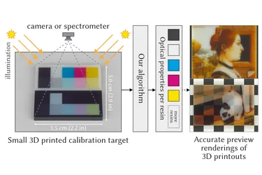
Our ACM TOG paper “Scattering-Aware Color Calibration for 3D Printers Using a Simple Calibration Target” earned an Honorable Mention at SIGGRAPH Asia 2025.
11 Mar 2026
Tobias Rittig
Vojtěch Tázlar
Thomas Nindel
In 3D printing, validating the firmware decisions driving the movements of the print head and the deposition of material is crucial during the development of new printing platforms. For FFF printing, many slicer software packages come with a G-Code viewer as a debugging tool. For Material Jetting or Inkjet 3D printing there is unfortunately no such tool — until now.
controls hardware. Not only need movement instructions make sense in the real world, like accounting for gravity and avoid parts crashing into each other, but developers need a short feedback loop without having to test live on physical hardware. The solution is often to employ a robotics simulator that acts as a virtual counterpart to the hardware. This serves the developers both as a visual feedback system but also can be used for automatized testing and sensor analytics.
re-enact the movements of the printheads and simulate the deposited material as an idealized string with a squished cross-section. The string is drawn in a straight line between the start and endpoint of a movement instruction, without actually simulating the flow of liquid plastic. This naturally represents a massive simplification of the problem, but enables already 80% of use-cases (greetings from Mr. Pareto). All algorithms contributing to the spatial movements and thus the 3D shape can be validated and improved using such a tool. This is not only helpful to the software developers debugging their algorithms, but to end users, because it offers a quick peek into the slicer’s ideas of how to print critical areas of the printout.
In an inkjet printer, the printing strategy look vastly different from a filament printer. Instead of directly “drawing” the object’s outline and interior using an infinite string of plastic, an inkjet 3D printer sweeps the build platform in regular intervals along one axis, while firing tiny droplets out of its 100 or so nozzles. The liquid droplets land on a flat build plate and get pinned into positition by a UV light following the print head. This starts the photo-activated curing process of the resins, which lets them change from liquid to solid state.
This principle is the same for 2.5D flatbed printers that print onto other existing material (paper or sheet goods from wood or metal) as well as 3D printers that create objects from scratch. Multiple layers can be placed on top of each other, gradually building up material for a relief look or full 3D object. Each layer is build up from rows of droplets that were jetted by different nozzles and potentially different print heads. This different principle also requires a new form of firmware instructions that control the printing process: Instead of G-Code, Inkjet printers rely on what’s called a “Print Plan”.
Quantica, an emerging inkjet printer manufacturer, approached us with the request to develop an internal development tool for them that would help their Writing System team in developing the printing algorithms. The important factor was that it had to be in 3D to provide a benefit over looking at slices as images and allow for interactivity. We have worked with them successfully in the past, when developing a slicer software for them. So we took on the challenge, and delivered a solution from the ground up in only 3 months.
Note: The requirements are also different to the Slicer Viewer feature we have in PrismSlicer, as the input data is in a much more hardware-oriented format provided by a processing step after the slicer.
The whole process from start to finish was comparatively quick and efficient for a brand new project. After signing the contract, the actual development time was only 3 months. Despite having numerous unknowns and only vague ideas of how the features should behave, we managed to deliver a more-than-satisfactory product at the end.
We achieved this thanks to an iterative approach to project planning (Agile and Scrum are some of the keywords here). The timeline was split into roughly bi-weekly deliverables and feedback meetings to keep a consistent rhythm with short sprints. This closed feedback loop allowed the clients to also adjust the project goals during developments and react to new findings and changes in circumstances. At each meeting we would discuss the new features from the previous sprint, any feedback on the previously delivered version and then decide for the goals of the next sprint.
As our company is a spin-off of a university, our engineering and leadership team has extensive experience with handling projects with a great degree of uncertainty. In academic research, it is not unlikely — one could say even mandatory — to embark onto year-long projects where feasability is unknown while the technology stack and circumstances are constantly changing.
During the project we emphasized on delivering every milestone on-time, in a tested and working condition. In the two occasions where bugs had made their way into the product, we delivered a fix within days to keep the customers happy.
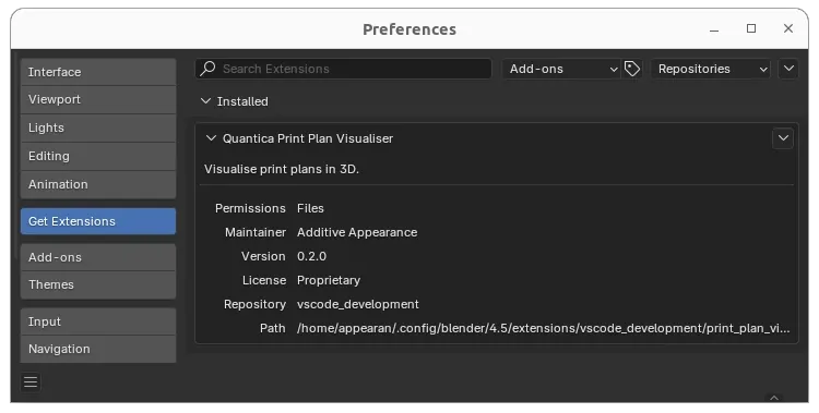
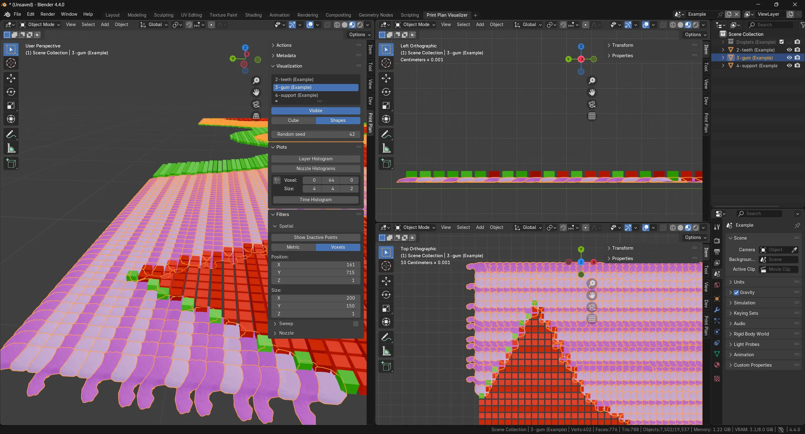
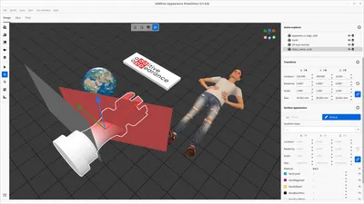
We chose to implement this tool as a plugin to Blender, an open-source 3D modeling and simulation application. The benefit is that we could leverage the Python interface to script this plugin, which would ensure a high speed of development and good maintainability for the future. The framework also has many components that are usually a friction point in developing new 3D applications: A responsive 3D viewport with click support, a scene graph, a way to design UI, etc.
The fact that it is available for all major operating systems and that Python plugins run cross-platform with a single code base is another benefit. We found that the Python API was reasonably well documented and if we ever ran into a undocumented, niche function, we were able to read its C source code to figure out how to use it correctly.
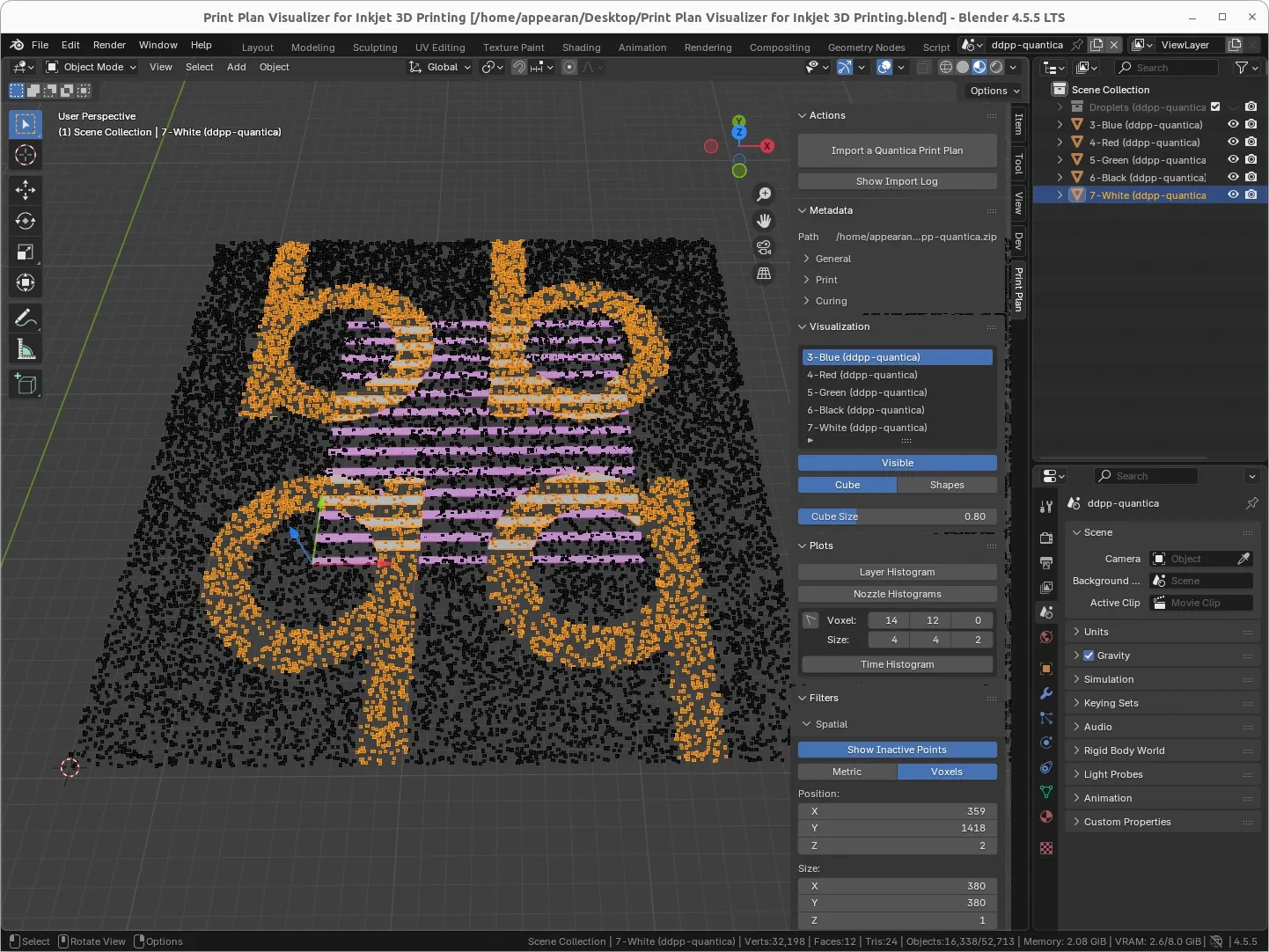
The general workflow of working with the visualizer starts with importing the print plan. The 3D viewport then displays a point cloud representation for the whole plan, with a smaller active region showing data with more detail. A selection of filters is available to narrow down the amount of voxels that are displayed, such as with a 3D crop region, hiding specific print heads or its nozzles as well as a time-based filter.
Clicking in the diagram will jump to the corresponding feature descriptions!
First the voxel data is loaded from the print plan, which is basically a set of images that the printhead jets with each movement. Each row in an image corresponds to one nozzle of the printhead, which in the image is underneath each other, but in the real world has a certain distance depending on the nozzle pitch of the printhead model. Thus it is required to reconstruct the 3D droplet positions from the layer height (Z), sweep motion (X) and nozzle numbers (Y). From that a lot of Blender internal data is generated for each voxel.
While loading, the print plan’s consistency is checked: If the contained metadata and image data are all in agreement with each other. Multiple checks are implemented that provide the engineers with detailed reportings in which layers or sweeps the inconsistency occurs.
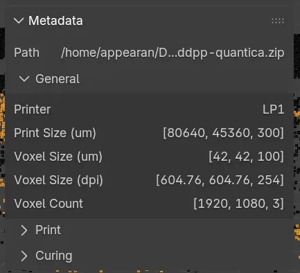
A print plan contains a lot of metadata and settings for the printer that is usually optimized for machine readability. We display this data in a more user-friendly way, for quicker navigation and being able to reference back to the input settings that generated the print plan. In this screenshot, the general print information such as voxel sizes (µm / dpi) and print dimensions (µm / voxels) are shown.
The amount of data is so big, it can’t be displayed all at once without significant performance penalty. Hence, the viewport is only showing a subset of voxels with a crop region. Outside the region, only some voxels are represented as points. The crop region can be moved around in the viewport with a gizmo.
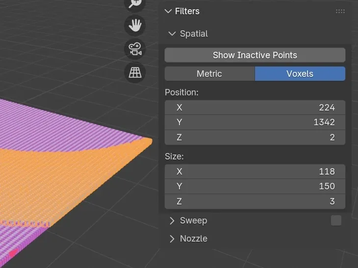
The exact region can be specified in metric units (µm, mm, cm etc) or in voxel counts in the UI as well. The points outside the active region which sparsely represent the remaining voxels can be hidden.
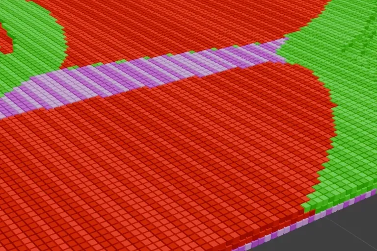
The 3D viewer can display either idealized cubes according to the voxel size specified in the print plan’s metadata or randomly distribute a set of droplet shapes that are a more realistic representation. The cubes can be scaled, either to reveal gaps between them for easier visual parsing, or show potential material mixing when droplets of different materials would overlap each other.
Droplet shapes, which replace the default voxel cuboids, can be enabled on a per-printhead basis and repeatedly randomized to see how different shapes would overlap each other. Together with the sweep animation it is possible to analyze in which direction the surplus material would likely be flowing (i.e. away from already pinned droplets). The shapes themselves are 3D scanned and can be configured to be varying per material or even printing direction (forward / backward pass).
Using an orthographic camera and the X-ray feature of Blender, one can inspect the overlapping regions of droplet shapes and how much material is potentially colliding.
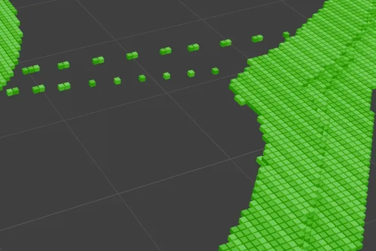
Multiple printheads can deposit the same material in order to speed up the print process. We can enable or disable all voxels from one printhead in order to disect where a certain droplet came from. And to visualize the interplay between different printheads in filling an area with droplets.
The sweep filter can display voxels corresponding to a specific sweep/pass. This allows us to see how the layer is build up from individual droplets sweep by sweep. Forward passes and backward passes are coded slightly different by brightness. One can scroll through individual sweeps, or let a layer be slowly filled by displaying a whole range of sweeps.
The visualizer can show how individual nozzles of a printhead are used to deposit certain droplets. It lets the user deactivate individual nozzles or whole ranges of nozzles. For that, an intuitive interface with a nozzle visualization is displayed for each print head, which highlights the presense of dead nozzles and gives immediate feedback which nozzles are currently activated.
The nozzle selection can be performed by a simple black and white list, where the user inputs a comma seperated list of nozzles he wants to deactivate or explicitly activate. For convenience, one can also input a range of nozzle numbers. An example string could look like 1, 2, 3, 50-65, 68, 42. By combining a deactivation list and a re-activation list, the user can quickly perform a precise nozzle selection for a print head which filters the droplets that are visible in the 3D viewport in real time.
The tool can generate various interactive reports that allow to inspect statistics over the print plan as a whole or for a local region that the user can select with a single click. This allows the user, in this case the printer engineer, to evaluate in more detail, which macroscopic properties the newly developed print strategy exhibits.
Try the interactive reports yourself by clicking on the preview images!
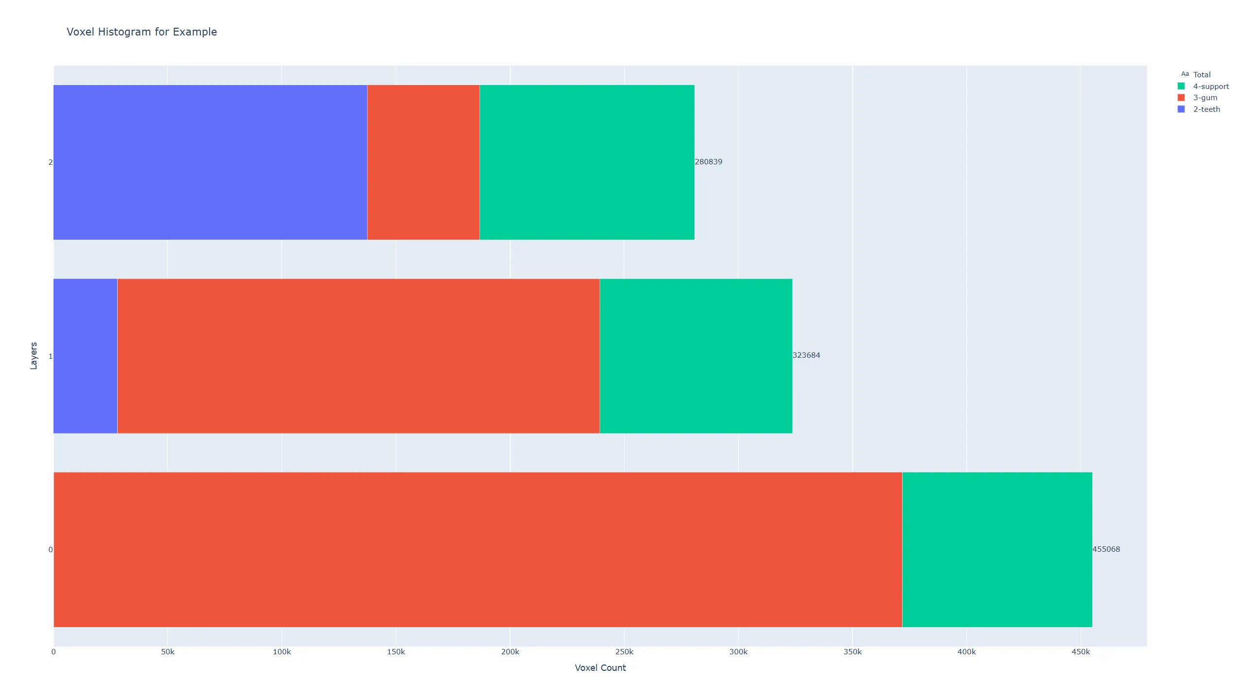
The layer histogram reports how many voxels per printhead are printed in each layer. So you can see for each layer (Y axis), the total number of printed voxels (label on the right of the bar chart, X axis) in comparison to other layers. Additionaly you see with a color coding, what the contribution of each printhead to this layer is. On the right side, you can toggle the visibility of each print head in the plot. Try it yourself:
Layer Histogram Demo
.
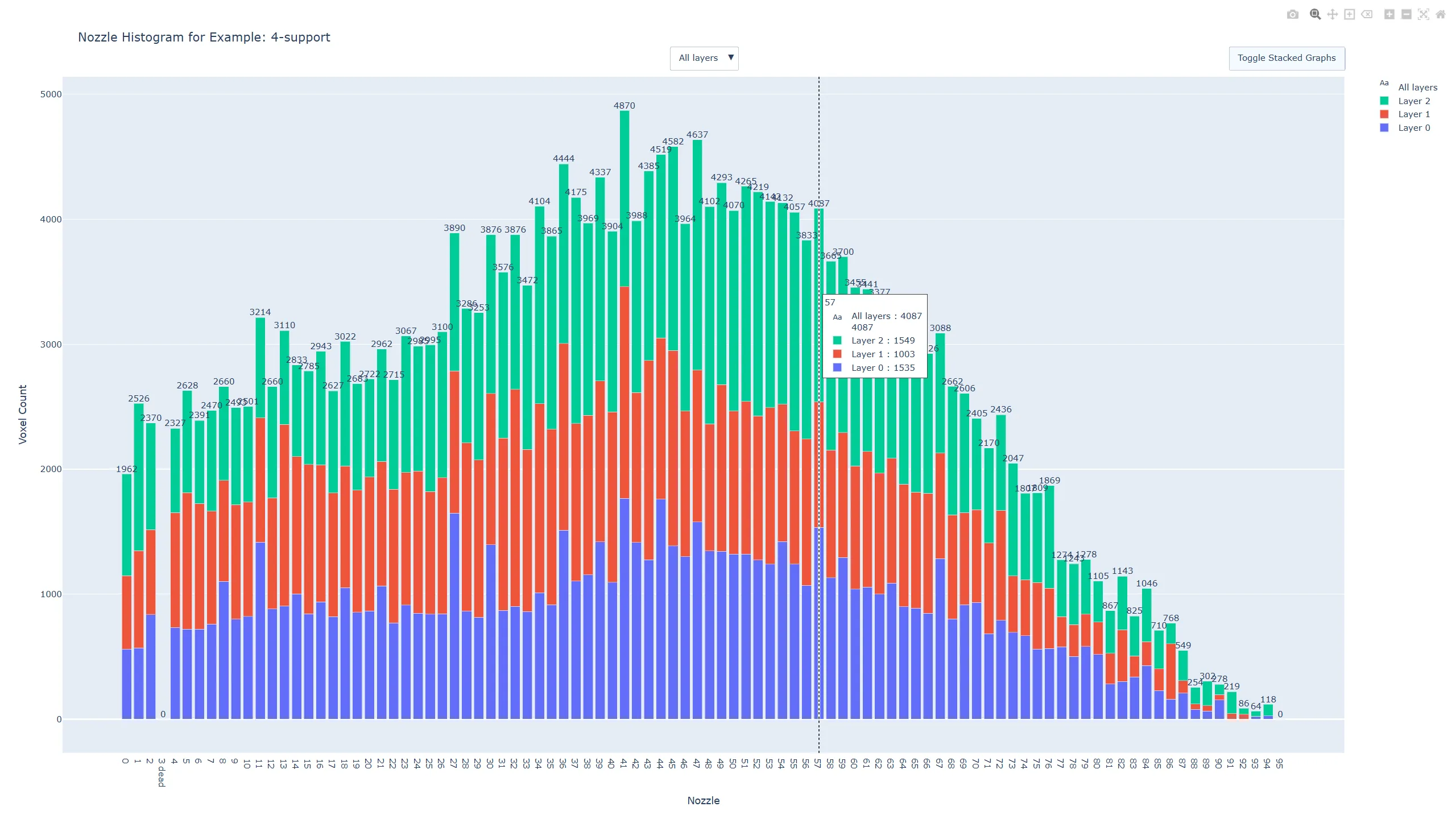
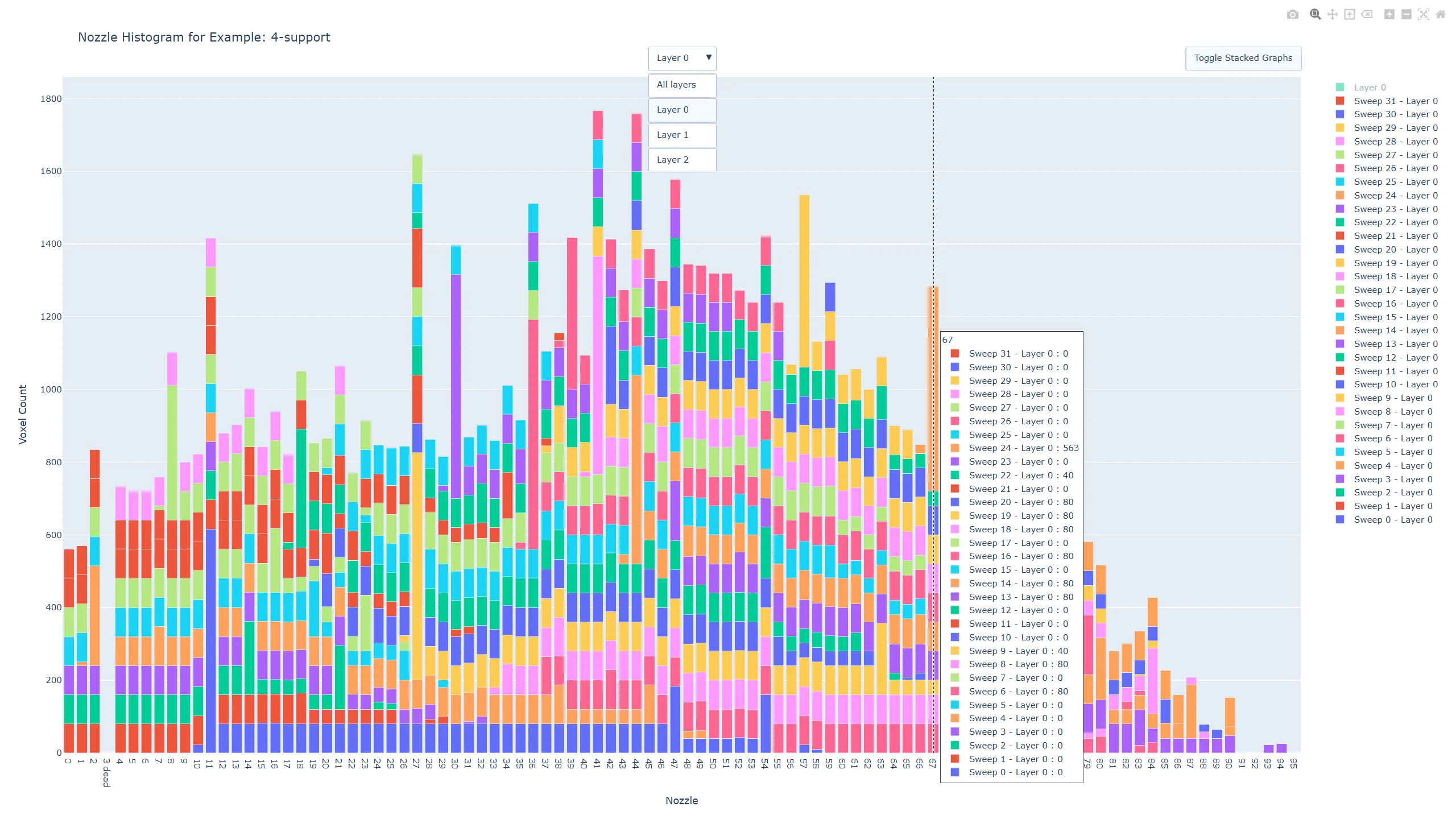
The nozzle histogram diplays how many voxels (Y axis) each nozzle (X axis) has been deposited. In the default view (“All layers”), this provides an overview over all layers in the model, where each layer has its own color. The overall shape of the histogram allows to see which nozzles are underutilized, which ones are marked as dead, and which ones might be overly used in a certain layer or sweep. When selecting a specific layer from the dropdown in the top center, the color coding changes to per-sweep. Thus one can further investigate how the sweeps are contributing to the whole layer, and which nozzle might be used heavily in individual sweeps. One can toggle the view from a stacked bar graph to a side-by-side bar graph for better comparison of layers/sweeps. As with the layer histogram, the legend on the right side allows for toggling the visibility of layers or sweeps. Try it yourself:
Nozzle Histogram Demo
.
Unlike the previous global reports. the time histogram is generated for a specific voxel by selecting it using a viewport click in Blender or providing its XYZ coordinates. Its purpose is to show the time differences between the central voxel and its surrounding voxels, meaning when which voxel has been deposited and how much time has passed in between. This is an important measure of knowing how cured the droplets already are and how well new droplets would bond to them, or how much time they had to deform from the ideal droplet shape.
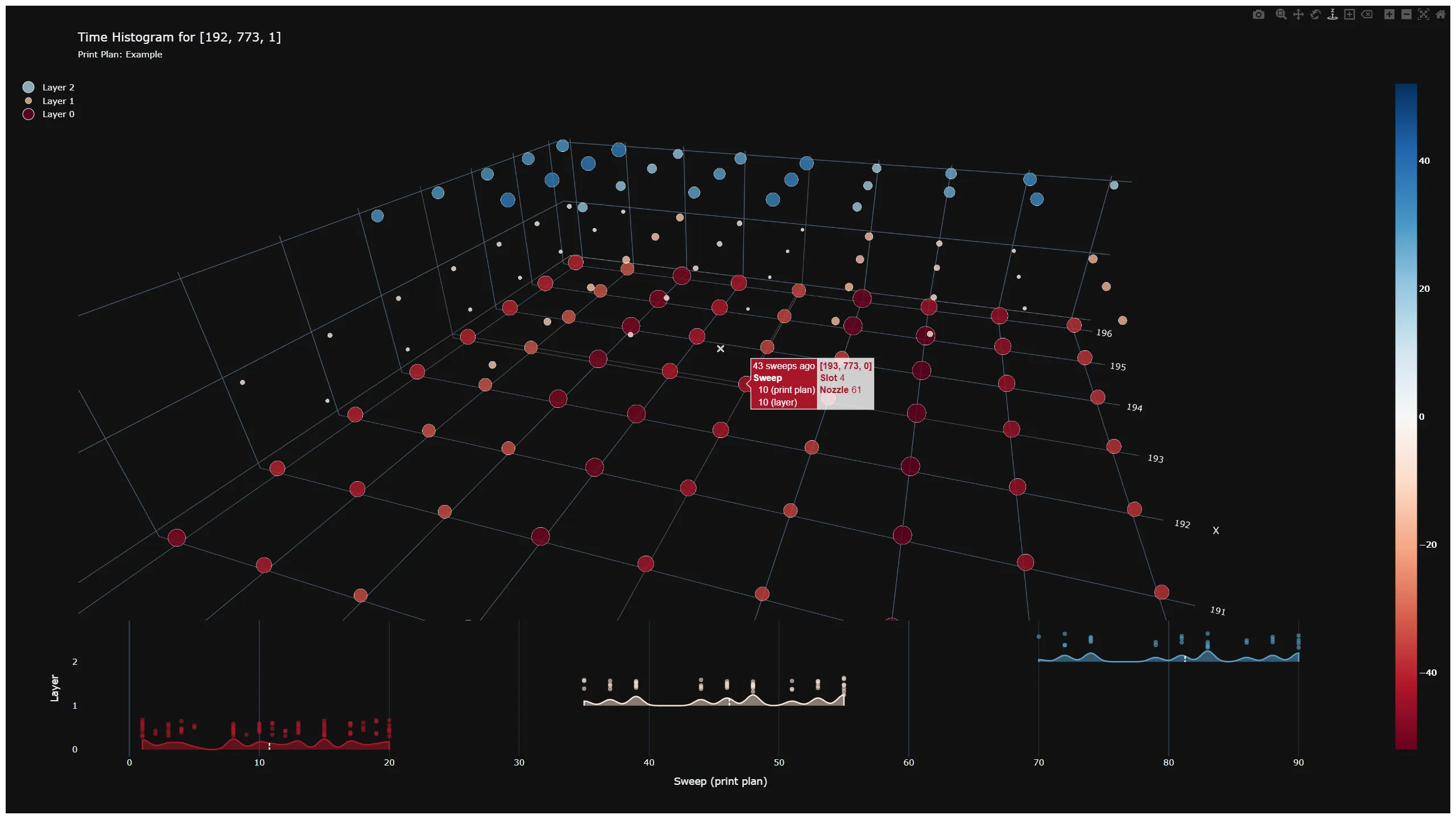
The 3D plot depicts individual voxels as points with various color and size. Both color and size encode the time difference (measured in sweep numbers) between the central voxel (marked with an X, by definition 0 time difference) and its surrounding. The color scale on the right shows how the color relates to actual time difference values. Blue generally depicts the future, whereas red represents the past. Hovering each dot, one can see additional information for this voxel (coordinates, noozle number, printhead number).
The bottom of the plot has a secondary subplot, that shows for each layer (Y axis) the distribution of voxels over absolute time (X axis, in sweep numbers). The legend on the left allows for toggling the visibility of individual layers. Try it yourself:
Time Histogram Demo
.
We have successfully delivered a custom software project for our customer Quantica, based on their requirements. Thanks to a smart choice of technologies like Blender and Python, we were able to deliver the project in less than 3 months from concept to final delivery. The Print Plan Visualizer is a versatile tool for inkjet development that is now also available for licensing to interested parties.
If you would like to get access to this tool
or
have a project idea of your own, don’t hesitate to contact us!
Our ACM TOG paper “Scattering-Aware Color Calibration for 3D Printers Using a Simple Calibration Target” earned an Honorable Mention at SIGGRAPH Asia 2025.
Press release announcing our new slicer software: A Photorealistic, Color-Optimized Upgrade for Multi-Material 3D Printing
A step-by-step guide to generate accurate, photorealistic previews of PolyJet color prints so you can soft‑proof your design before printing.